Since I started dealing with web design, I have noticed this:
People often say they want a "beautiful site", but that's not what they're actually looking for.
When they enter a site, they want to be able to immediately understand what to do.
To access the information they are looking for quickly, to avoid confusion, to avoid getting tired…
Design comes into play here, but not as an ornament, but as a guide.
Why Are Websites Starting to Look Similar to Each Other?
In recent years, many sites have the same feeling.
The reason is not just ready-made systems.
Most work is done in a hurry.
The logic of "Let's get it on the air as soon as possible" prevails.
This shortens the thinking part.
However, the language of expression for each job is different.
A tradesman site needs another tone,
one corporate company is different.
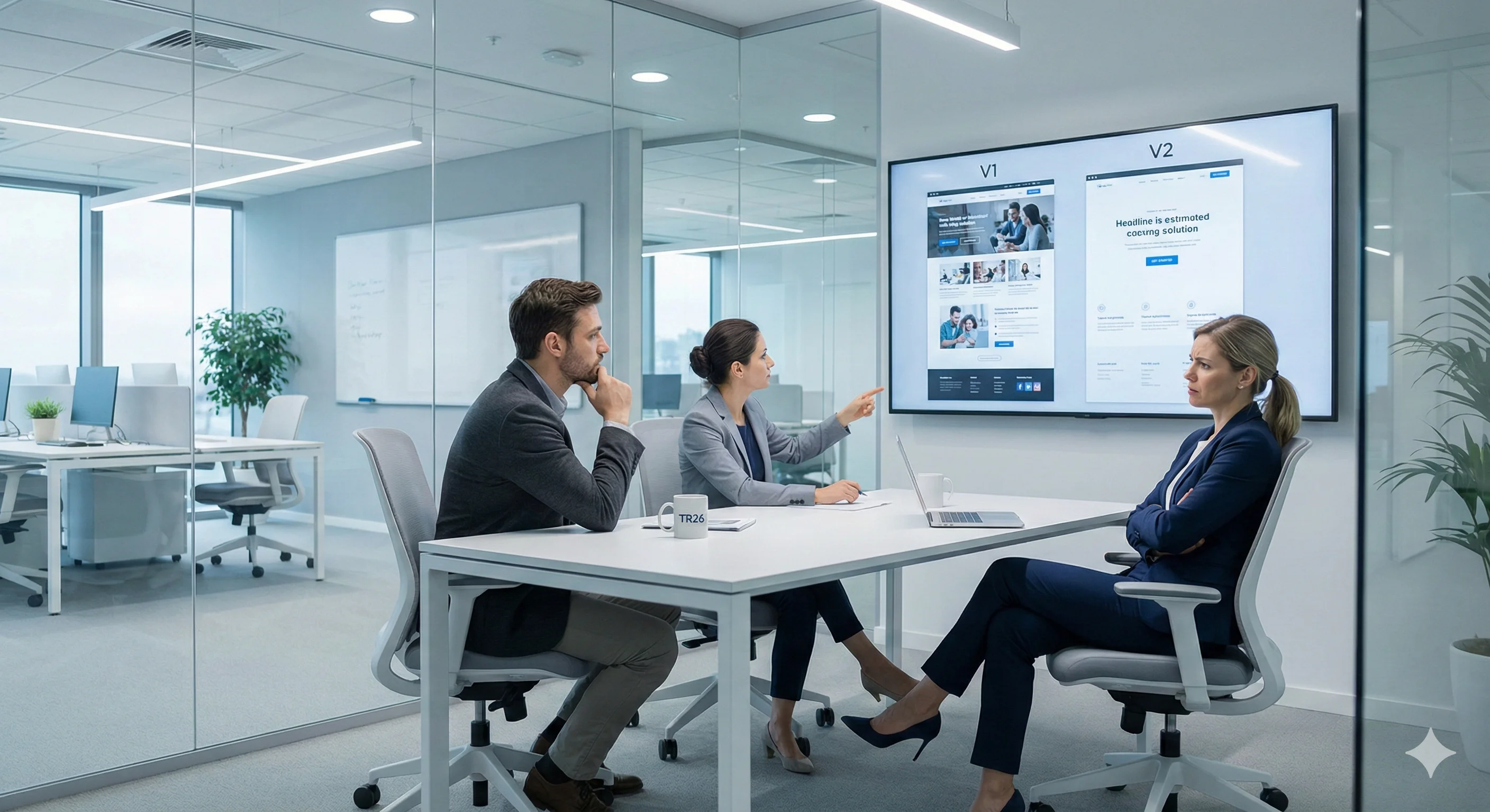
The same template does not fit everyone.
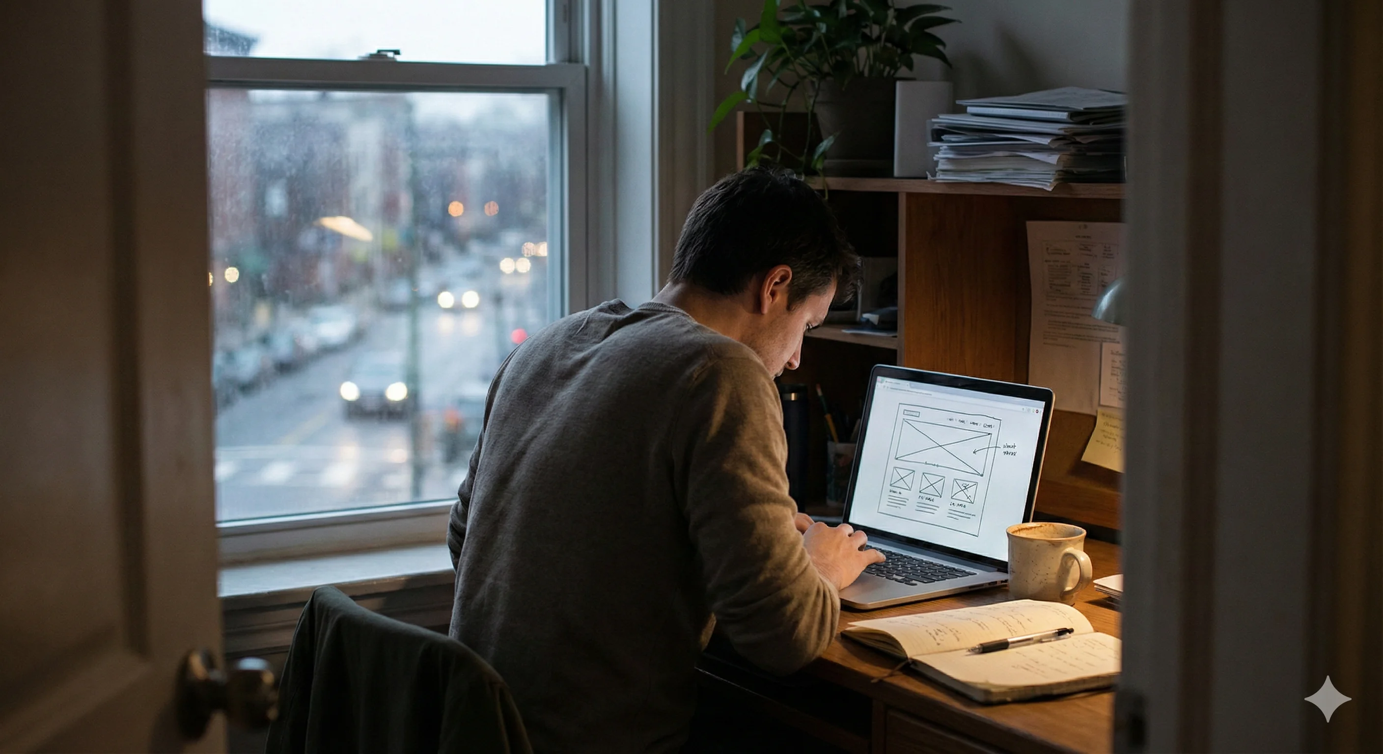
Design is not on the screen, but in the head first. It starts
I usually don't start designing by turning on the computer.
First I think:
What is someone coming to this site looking for?
Design made before the answer is clear,
No matter how neat it looks, it is incomplete.
The user remembers the answer, not the design.
Plain It's Not Easy to Be
It's easy to show everything.
The difficult thing is to remove what is not really needed.
People hesitate when simplifying a page.
“Did I reduce it too much?”
But most of the time, the simplified page is easier to read,
gives more confidence.
You see this more clearly over time.
A Website Doesn't End Once It Goes Live
A website After it is published, the real story begins.
As visitors come and questions change, the site should also change.
Sometimes simplifying a single sentence is a good idea.
sometimes removing an image
It relaxes the entire page.
The website is a living thing.
It shouldn't freeze.