The concept of "Mobile Compatibility", which has been talked about for years in the web design world, has been replaced by a completely "Mobile-First" structure as of 2026. Google now accepts the mobile version of your website as the primary reference, not the desktop version. In other words, a website that looks great on desktop but is incomplete or malfunctioning on mobile is considered "non-existent" in the eyes of search engines.
This strategic change requires website owners to radically change their perspective on design processes. The era of "Let's make it for desktop and then look at mobile" is over. Design should be designed starting from the smallest screen and evolve according to expanding screens.
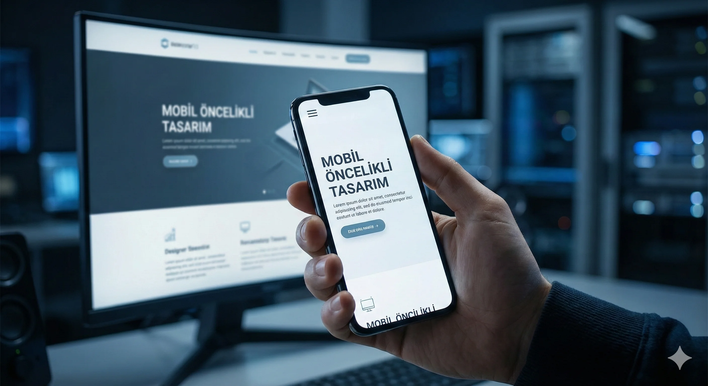
Difference Between Responsive Design and Mobile-First
Most business owners confuse these two concepts. Responsive Design means that a content prepared for the desktop fits on that screen by being compressed or displaced when the screen becomes smaller. Although this technically works, it is no longer sufficient in terms of user experience.
Mobile-First Design, on the other hand, centers the mobile user from the very beginning of the process. Content hierarchy, button sizes, menu structures and visual dimensions; Optimized for finger movements and vertical screen usage. A fast and functional structure is established that is free from unnecessary decorations and serves only the purpose. This structure is then adapted to tablet and desktop screens.
Mobile UX (User Experience) Standards
For a website to be considered mobile-first, it must meet the following technical standards:
- Touch Targets: Links and buttons should be large enough to be easily clicked with the finger (at least 44x44 pixels) and at sufficient distance from each other.
- Readability: Font sizes should be readable without forcing the user to zoom.
- Navigation: Instead of complex mega menus, simplified and easily accessible menu structures (Hamburger menu, etc.) are preferred. should be done.
- Content Equality: Hiding important content shown on the desktop version from the mobile version so that it does not "take up space" is a serious mistake in terms of SEO. Google does not index content it has not seen on mobile.
Effect on Conversion Rates
In an ecosystem where more than 70% of users do initial research from mobile devices, mobile design directly affects sales and marketing performance. Forms that are difficult to fill out on mobile, pop-up windows that do not fit on the screen, or images that load slowly; causes the potential customer to go to the rival site within seconds.
Especially in the e-commerce and service sectors, positioning action buttons (CTA) such as "Call Now" or "Contact Via Whatsapp" in the thumb zone (Thumb Zone) of the screen can increase conversion rates by up to 30%.
As a result; mobile-first design is a “focus” strategy, not a “minimize” process. It is the art of clearing your website from unnecessary loads and offering the purest and fastest experience to the user. The digital future of your business is now taking shape inside that small screen in your pocket.